
Fit text to its container at build time with a variable font
How my name runs edge to edge on this site with no JavaScript: font metrics measured at build time, the wdth axis, cqi units and font-stretch.
The name at the top of this site's home page runs edge to edge, and no script sizes it. At build time I measure the variable font Anybody at both ends of its width axis, then solve each line's font size and width so it fills its container. The page ships the answers as cqi units and font-stretch values, so the browser draws the heading at its final size from HTML and CSS alone.
TL;DR
- Why: the heading is the LCP element, so fitting it with a script means either a layout shift or a later LCP.
- How: a build script measures Anybody at
wdth50 and 150. Widths in between are close to linear (at most 0.06% off), so each line's size andfont-stretchtake one division.- Result: nothing is measured on load, and the letter animation on top waits for the reader's first move.
Why not fit the text with JavaScript on load?
The usual way to fit a headline is a script: render the text, measure it, scale the font until it fills the box, repeat on resize. Here the heading is my name, the largest thing on the first screen, so it is the Largest Contentful Paint (LCP) element. A script fit leaves two bad options.
- Render first, fit later. The text appears at a guessed size and then jumps, and everything under it moves too. web.dev calls that a layout shift: a visible element changing its position from one rendered frame to the next.
- Hide it until it fits. web.dev excludes elements with an opacity of 0 from LCP, so the LCP now waits for the script, the font and the measurement.
I wanted neither. So the fit happens before the page exists.
What makes a build-time fit possible?
Anybody is a variable font under the OFL, with a width axis (wdth) from 50 to 150 and a weight axis from 100 to 900. In CSS, font-stretch drives the wdth axis: MDN lists it as that axis's property, and recommends such high-level properties over font-variation-settings. The CSS Fonts spec has since renamed font-stretch to font-width, but MDN marks font-width as limited availability, so the site keeps the old name.
The key fact: at a fixed weight, the advance width of every glyph, and every kerning pair, changes linearly with wdth. Know a line's width at 50 and at 150, and you know it at every width in between.
"Linearly" deserves a footnote. The font has a master at 100, so strictly the curve is two straight pieces that meet there. I checked it with fontkit at nine points from 50 to 150: for MATEUSZ, MUSZARSKI and kerning-heavy pairs such as AV and TO, the real width is at most 0.06% off the line. The fit aims at 99.5% of the container, which absorbs that.
What does the build measure?
- 01 bun run fonts Measures every display character at wdth 50 and 150.
- 02 Metrics file Two numbers per character and kerning pair, committed.
- 03 Fit.astro Solves each line's size and width during the site build.
- 04 HTML and CSS cqi sizes and font-stretch values, nothing to measure.
A Node script, scripts/fonts.mjs, runs when the type changes, not on every deploy. It subsets the font, writes the @font-face rules and a metrics file for every character a fitted line may use: Latin, Polish and Spanish capitals, digits and some punctuation. Today that is 72 characters and 406 kerning pairs.
// simplified from scripts/fonts.mjs
const at = [50, 150].map((wdth) => font.getVariation({ wght: 900, wdth }));
const em = (units) => units / font.unitsPerEm;

for (const c of DISPLAY) adv[c] = at.map((f) => em(f.layout(c).advanceWidth));

for (const a of DISPLAY)
  for (const b of DISPLAY) {
    // kerning = the pair's width minus both glyphs on their own
    const k = at.map((f) => f.layout(a + b).advanceWidth - f.layout(a).advanceWidth - f.layout(b).advanceWidth);
    if (k.some((v) => Math.abs(v) > 0.5)) kern[a + b] = k.map(em);
  }
The output is a plain object of numbers in em. It is committed, so the site build never touches the font tools.
How is each line solved?
With the metrics, a line's width at any wdth is a sum of interpolations. The fit takes two steps.
- Take the widest line at a chosen base width. Its width in em sets the font size: a line 4.30 em wide fills its container at 100 / 4.30, about 23.2
cqi. - For every other line, solve for the
wdththat makes it exactly as wide. Width is linear inwdth, so this is one division, not a search.
// simplified from src/lib/fit.ts
function fitLines(lines: string[], base: number, locale = "en", fill = 0.995) {
  const upper = lines.map((line) => line.toLocaleUpperCase(locale));
  const target = Math.max(...upper.map((line) => lineEm(line, base)));
  const wdth = upper.map((line) => {
    const lo = lineEm(line, 50);
    const hi = lineEm(line, 150);
    return clamp(50 + ((target - lo) / (hi - lo)) * 100, 50, 150);
  });
  return { size: (100 * fill) / target, wdth }; // size in cqi
}
Lines are uppercased with the page's locale rules first, and the fill of 0.995 leaves room for rounding between the build and the browser.
How does the result reach the CSS?
The size is in cqi. MDN defines 1 cqi as 1% of a query container's inline size. Each fitted block sits in a wrapper with container-type: inline-size, so the type scales with its own box, not the viewport. One component sets every poster title on the site: my name on the home page and the CV page, the chapter titles, the blog's heading, the 404.
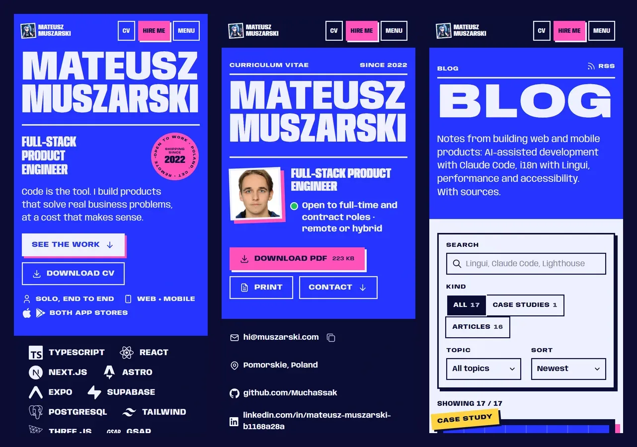 390 px phones
 The widths become font-stretch percentages in the HTML, one per line. On a phone a wide setting gives short, thin-looking type, so every block is solved twice, by default with a base wdth of 66 under 700 px and 96 above. A container query picks one.
.fit-host { container-type: inline-size; }
.fit { font-size: calc(var(--fs-n) * 1cqi); line-height: 0.8; }
.line { display: block; width: max-content; white-space: nowrap; font-stretch: var(--w-n); }

@container (min-width: 700px) {
  .fit { font-size: calc(var(--fs-w) * 1cqi); }
  .line { font-stretch: var(--w-w); }
}
For my name the build writes, in the narrow case, 23.118 cqi with MATEUSZ at 84.97% and MUSZARSKI at 66%. In the wide case it is 16.115 cqi, with 121.33% and 96%.
What happens after the first move?
A small enhancement turns a fitted title into a letter accordion: letters near the pointer widen, the others narrow, and the line stays flush. Without a pointer, a slow wave runs through the home page name. It is the same linear idea, applied to single letters.
- Each line is split into one span per letter, hidden from assistive technology behind one visually hidden copy of the text, so screen readers read the name once.
- Each letter is measured once at
wdth50 and once at 150: its width, and the pixels it gains per unit ofwdth. - Each frame draws a bell curve around the pointer or the wave. Before widening letters along it, the curve's average, weighted by each letter's slope, is subtracted, so the changes add up to zero. When a letter hits 50 or 150, a slow correction pulls the line back to flush.
My first version started as soon as the page had loaded: split, measure, then restyle letters every frame. On 7 October a trace on a throttled phone showed load-time loops like it eating the home page's main thread. Now the accordion waits for the first scroll, touch, key or mouse move, and splits a block only when it comes near the screen. Frames never measure letters: the only layout read is one bounding box per visible block, before any style is written.
It never starts under prefers-reduced-motion: reduce, and it pauses offscreen (an IntersectionObserver), on the site's pause button and when nothing moves: the rules from motion that respects people. A Playwright test checks at 1440 px that each line fills over 97% of its container, before and after the accordion starts. It also checks that the heading still reads as my full name.
Limits
- An unknown character fails the build. A fitted line with a character the metrics don't hold throws. I prefer that to a line that is silently a few percent short; the fix is to add the character and rerun the font script.
- Very uneven lines can't both be flush. The axis gives a range of about 3 to 1 (MATEUSZ is 2.51 em wide at 50 and 7.65 em at 150), so a two-letter line next to a fifteen-letter one stays short.
- The fallback font has no width axis. Until Anybody arrives, the browser shows a metric-matched local face such as Arial Bold, and MDN notes that
font-stretchdoes nothing without condensed or expanded faces. The size is right (it comes fromcqi), the lines are uneven. How long that lasts on a slow network, I haven't measured. - The metrics belong to one font file. Change the font, the weight or the subset and the numbers go stale; nothing checks that someone reran the script.
The same component sets the name on my web CV, whose PDF stays in sync with it, and the rest of the build is in the case study. If you're hiring for front-end work where details like this matter, my contact details are here.
Sources
- CSS container queries (MDN) (opens in a new tab) (accessed )
- font-stretch (MDN) (opens in a new tab) (accessed )
- font-width (MDN) (opens in a new tab) (accessed )
- font-variation-settings (MDN) (opens in a new tab) (accessed )
- Anybody, Etcetera Type Co. (GitHub) (opens in a new tab) (accessed )
- Anybody METADATA.pb, axes and licence (google/fonts) (opens in a new tab) (accessed )
- fontkit (GitHub) (opens in a new tab) (accessed )
- Largest Contentful Paint (LCP), web.dev (opens in a new tab) (accessed )
- Cumulative Layout Shift (CLS), web.dev (opens in a new tab) (accessed )
- Intersection Observer API (MDN) (opens in a new tab) (accessed )