
My old portfolio was a WebGL flight from Earth to Neptune. It looked great on my desktop. On a phone it showed an “Oops!” screen. This is the story of swapping it for a poster: the versions, the research, the sites I learned from and the reasons behind each call, mostly in pictures.
TL;DR
- Before: a 3D site that scored 34 on mobile Lighthouse and didn't work on phones.
- After: Astro, three languages, one font, a few shaders that never get in the way, and 95 to 100 on mobile Lighthouse.
- How: a project wiki before any code, research on award winners and real products, four live designs to pick from, and checks on every change.
What rules did I work by?
Six rules: most written down before the first line of code, the rest learned on the way. Everything below follows from them.
- Plan before code. The project lives in a wiki that every AI session reads first.
- Practical first, then wow. Impressive within 3 seconds, usable in one tap on a phone.
- Research, then pick. Real sites and real screens first; I choose between live options, not sketches.
- Show, don't tell. A picture or a moving demo wherever a paragraph would go.
- Keep every version. So I can show how it changed, and go back.
- Nothing ships unchecked. Tests, screenshots I look at myself, speed on a slow phone.
How did it go, version by version?
About four days, and every version is kept.
-
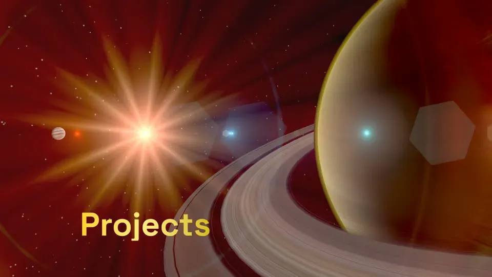 Replaced
 00 Before
The 3D space portfolio
A WebGL flight to Neptune. Beautiful on my desktop, an “Oops!” screen on phones.
- Kept
01 5 Oct 2026
Phase 0: a wiki, no code
Plan first, code second.
Research, requirements, brand, legal and the rules of the project, before a single component.
-
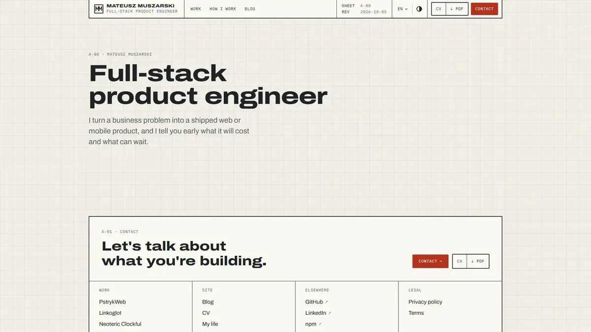 Rejected
 02 5 Oct 2026
Drafting Table
A clean system is not a good design.
Paper, cyanotype and a title-block header. It passed every check and looked forgettable.
-
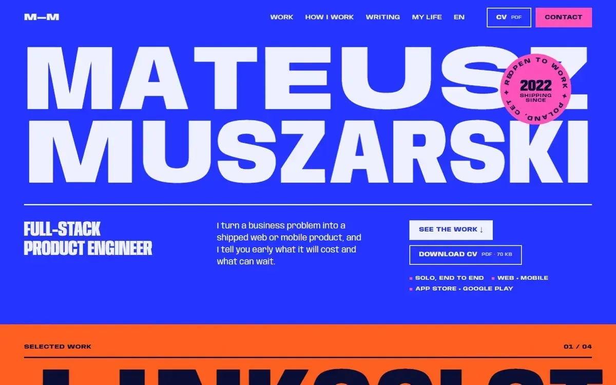 Poster picked
 03 5 Oct 2026
Four live directions
The type is the picture.
Orbit, Poster, Toybox and Exhibit as working pages. Claude recommended Orbit. I picked Poster.
-
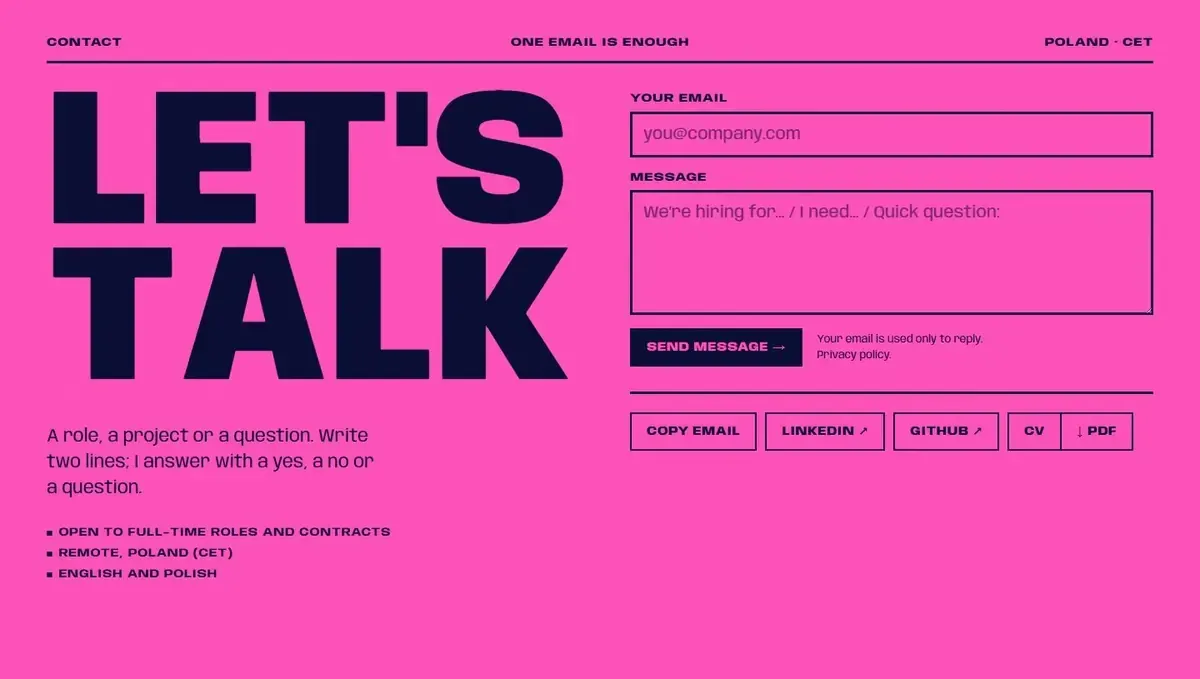 Notes
Notes 04 5 Oct 2026
Round 2: Poster everywhere
The whole home page in Poster, three colour themes and two fonts tried side by side.
-
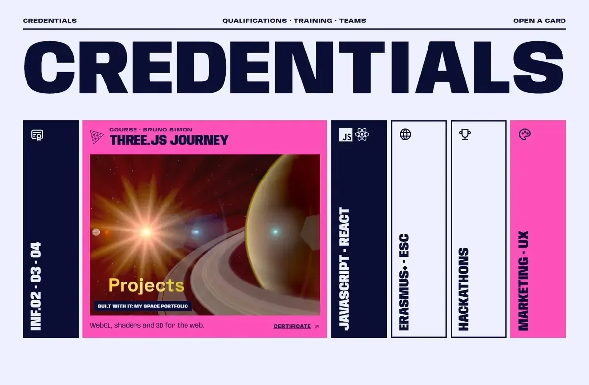 Approved
 05 5 Oct 2026
Round 3: less text
Less text, more to see.
Tool logos with their names, a reel per project, a shorter everything. The comps stop here and the real code starts.
-
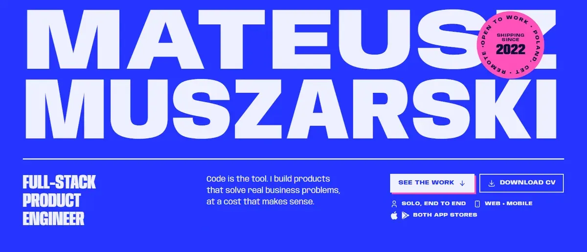 Live
Live 06 6-8 Oct 2026
The site you are on
Built in Astro one section at a time, then reshaped by rounds of my notes on the live site.
Why rebuild it?
Here is the old portfolio in motion:
Beautiful on my desktop. Then I measured it, on 5 October 2026:
- 13.8 MB before the start button. 7.6 MB of it was an emoji font.
- 34 on mobile Lighthouse. On a throttled phone the main content took 46.9 seconds to appear.
- Phones got an “Oops!” screen. The site didn't run there at all.
- Only a mouse wheel moved it. No touch swipe, no keyboard.
- Nothing for search engines. The raw HTML had no text to index.
Someone opening a portfolio from a LinkedIn message on a phone gives it maybe ten seconds. My old site spent them on a loading bar. It proved I can write shaders; it also proved I hadn't thought about the person on the other side.
So no preloader, no gate, no scroll-jacking, and the same content on every screen.
What is a portfolio for?
Showing your work. It sounds obvious, yet many portfolios bury the visitor under “about me” paragraphs, or pitch their tech stack as if it were sacred, and the projects end up three scrolls down. Here the projects come right after the name: “See the work” is the first button, the tools are one strip of logos, and the about-me has a page of its own.
How did the planning work?
Before any code, I wrote the project down in a wiki of markdown pages: the audience, the brand, the budgets, the legal texts. The idea comes from Andrej Karpathy's LLM Wiki (opens in a new tab): the AI keeps the wiki up to date itself, so what it learns builds up. Three Claude Code hooks put the right pages in front of every session:
- 01 Session starts The working rules and the lessons load first.
- 02 Each prompt A hook names the wiki pages the task needs.
- 03 The work Claude Code builds and checks with those pages open.
- 04 Turn ends If the code changed and the wiki didn't, the turn stops once.
More in An LLM wiki: project memory for Claude Code.
What did the research show?
Agents opened 20 developer portfolios that won Awwwards awards in 2023-2026, on a desktop and on a throttled phone (1.6 Mbps, a 4× slower CPU). Each got two scores from 1 to 5: Wow for how memorable it is, and Practicality for how fast you can reach the projects and the contact. Practicality was measured as the moment the first real link becomes clickable.
| Practicality → | |||||
|---|---|---|---|---|---|
| Wow ↓ | 1 | 2 | 3 | 4 | 5 |
| 5 |
|
|
| ||
| 4 |
|
|
|
|
|
| 3 |
|
|
| ||
| 2 |
| ||||
| 1 | |||||
Both scores 4 or more: only 4 of 20 sites
What came out of it:
- An award doesn't mean usable. On the throttled phone only 8 of the 20 were usable within 3 seconds, and 9 weren't usable within 10. The four least practical (game worlds and gated intros) even had a higher average Site of the Day score than the three most practical ones.
- The jury isn't hiring. Awwwards weighs design 40%, usability 30%, creativity 20% and content 10%, and the jurors are designers and developers. A recruiter asks one thing: can I find the projects and the contact?
- Stunning and practical is possible, but rare. Only four sites scored 4 or more on both. What they share: real links on the first screen, and the show beside the content, never in front of it.
Here is what that looks like on a phone. First, the immersive end:
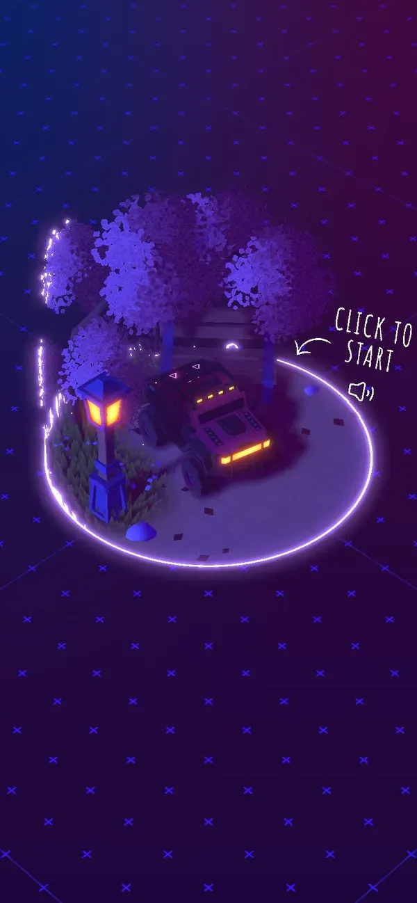 Click to start Bruno Simon
  No links in the HTML Samsy
  About 20 s of loading Jordan Delcros
 And the four that did both. Each one gave this site an idea:
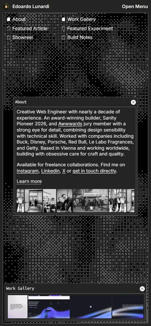 Real links on the first screen Edoardo Lunardi
 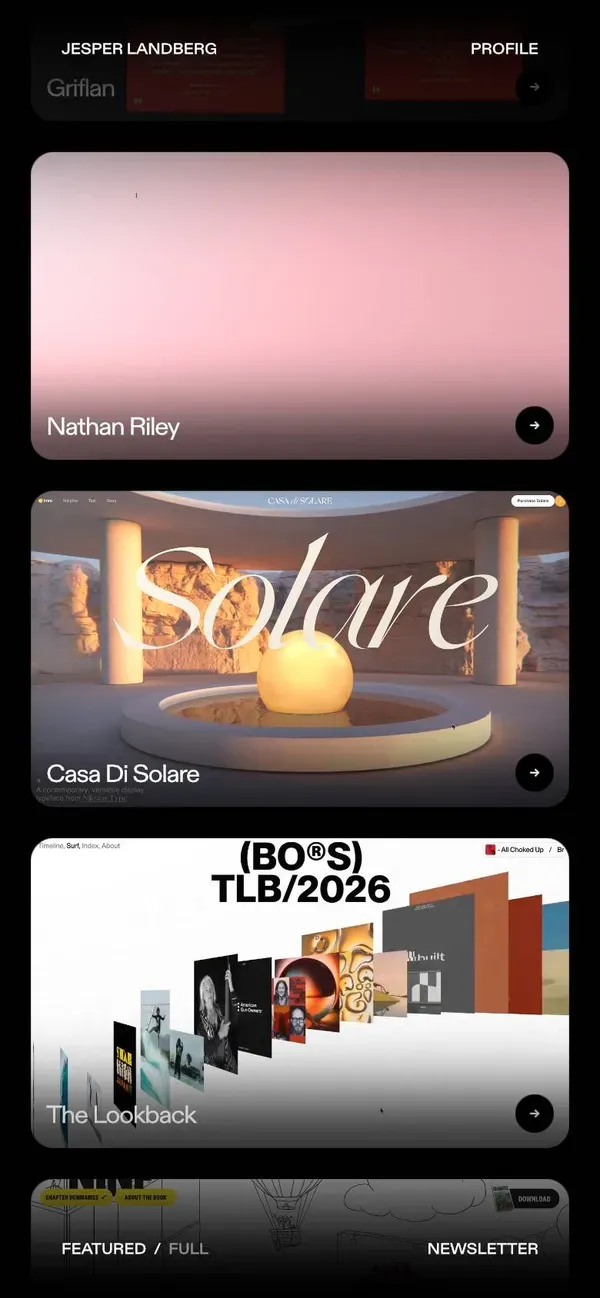 The show beside the content Jesper Landberg
 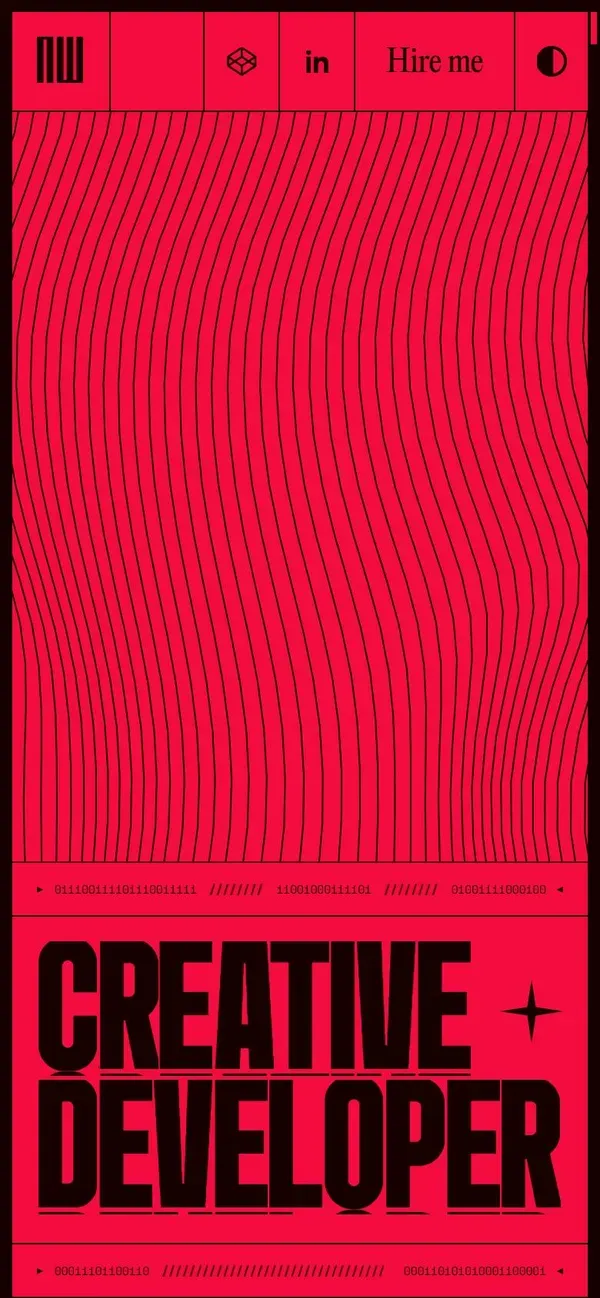 Hire me in the header Antoine Wodniack
 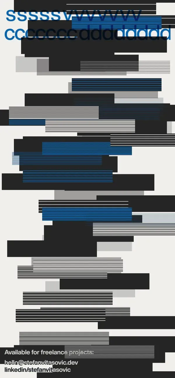 One signature effect Stefan Vitasović
 Section ideas came from Mobbin (opens in a new tab), a library of real screens from shipped products. The topic chips above my contact form are one of them: you start with a tap, not a blank field.
Why not another 3D world?
Honestly, I love them. My last portfolio was one. But I had measured both kinds of site by then, and the trade looked like this:
| A full 3D world | This site | |
|---|---|---|
| First screen | a loader or “click to start” | my name, my role and two buttons |
| Links | often none in the HTML (Samsy, Jordan Delcros) | every link is real HTML |
| Search engines and screen readers | text drawn in WebGL is invisible to them | real text, painted first |
| Slow phone | 9 of 20 award winners unusable within 10 s | shaders start after the text, only while visible |
| No WebGL or WebGPU | an error instead of the site (Kris Temmerman) | a CSS picture underneath |
So the wow stays, as a layer instead of a gate. Four shaders run on this site, all written for it with no library:
How do I run the AI?
Like a small team. I brief the lead agent, subagents research in parallel, MCP servers bring real data, hooks guard the risky commands, checks gate the result, and I review it. The AI does a lot of the typing; I own the decisions.
The building blocks are in Claude Code skills, hooks, MCP servers and subagents.
What happened to the first design?
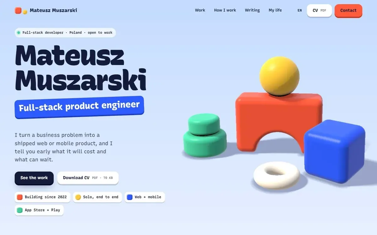
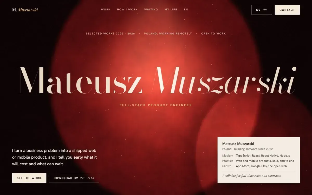
So Claude built four very different directions as live pages. It recommended Orbit. I picked Poster: brutalism with manners. Flat saturated colour, hard offset shadows, square buttons and type fitted edge to edge.
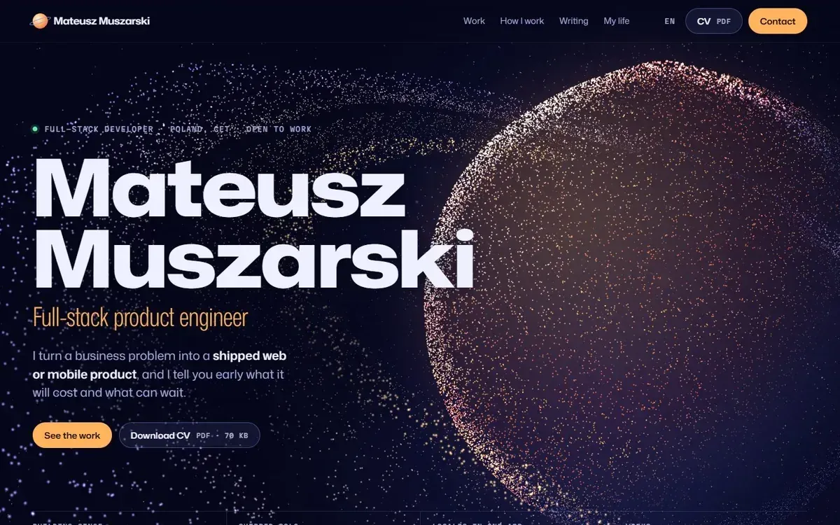 Claude's pick Orbit My pick Poster
  Toybox
  Exhibit
 How did each part change, and why?
Six parts of the site through their versions. Tap through them.
Round 2
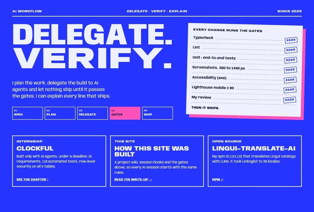
A checklist of gates. All true, and all the floor. It sold the checks, not the way I work.
Round 3
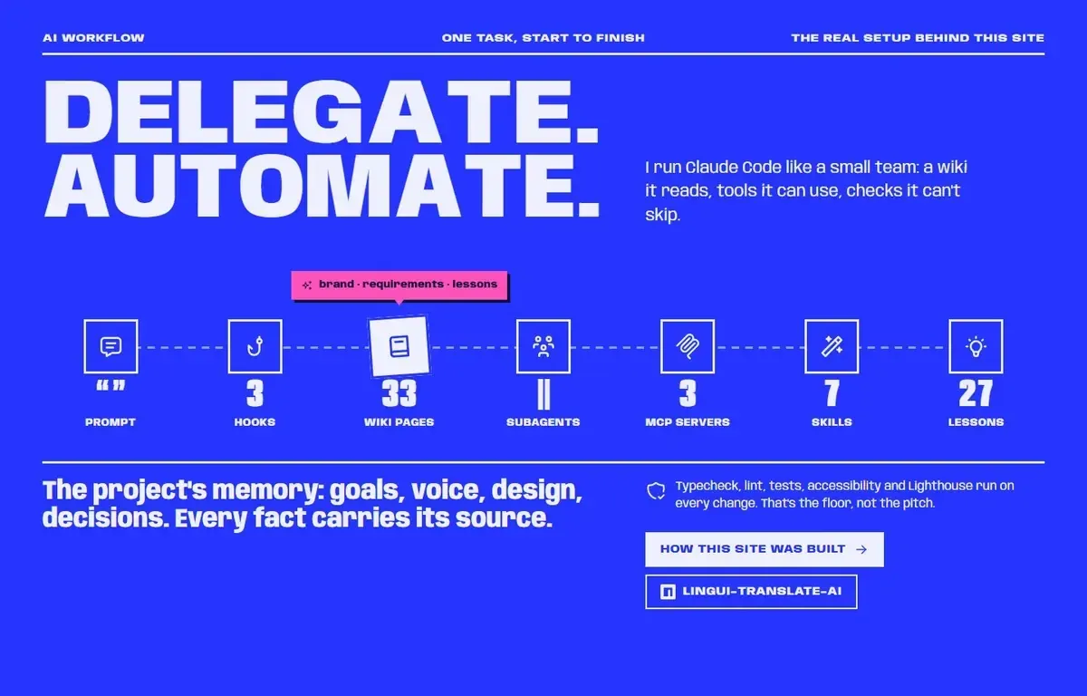
Counters for hooks, pages and agents. Numbers that change every week and say nothing about the work.
Now
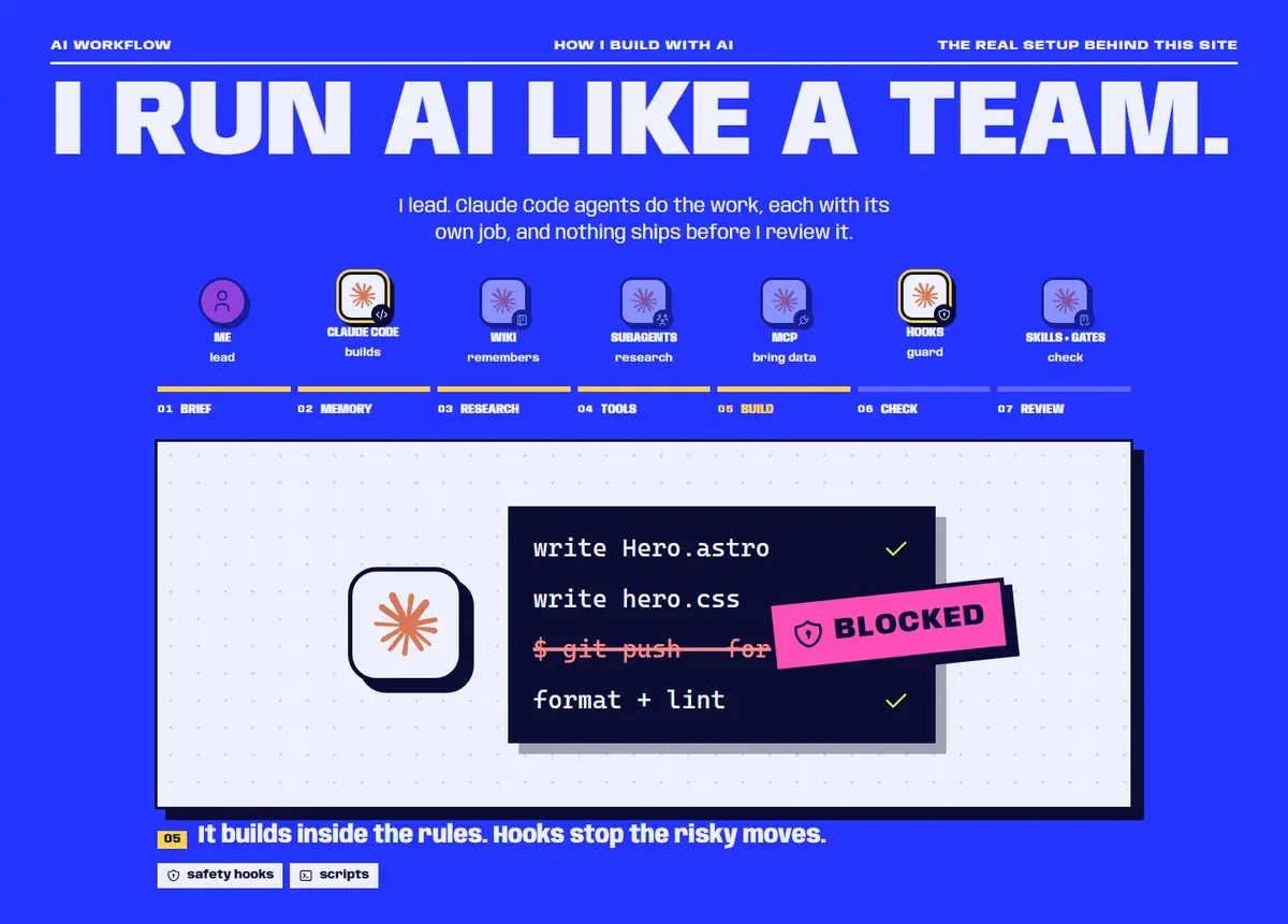
The decision Show how the work gets done, not how much of it there is.
One change in seven steps, from my brief to my review, each with a small drawn scene.
Round 2
Seven cards, each a paragraph. Everything visible, nothing readable at a glance.
Round 3
Sideways titles that open on hover. Compact, and hard to read.
Now
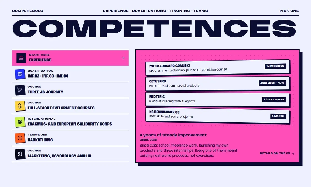
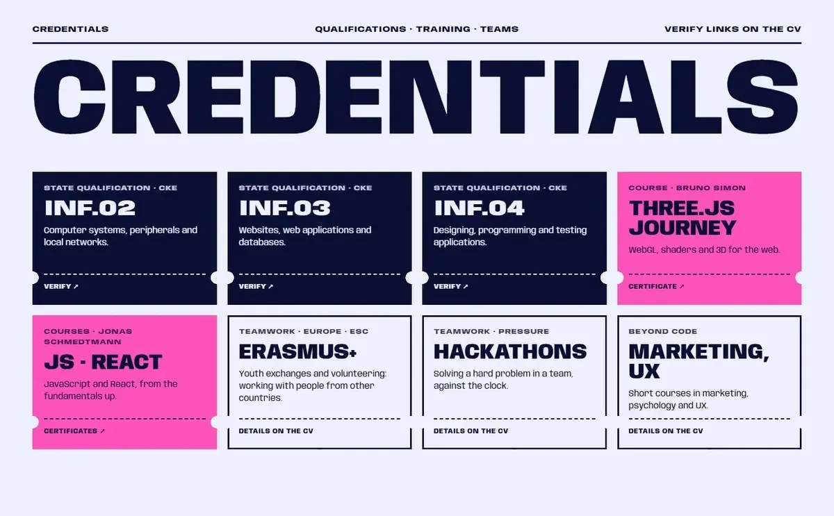
The decision Experience first, and every certificate checkable.
A list on the left, one open card on the right, a link to check every certificate.
Round 2
A normal form, and every field is a reason to stop.
Round 3
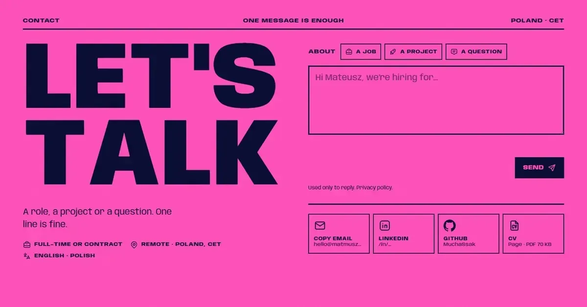
The decision As few fields as possible.
Message first. The reply field appears once you start typing.
Now
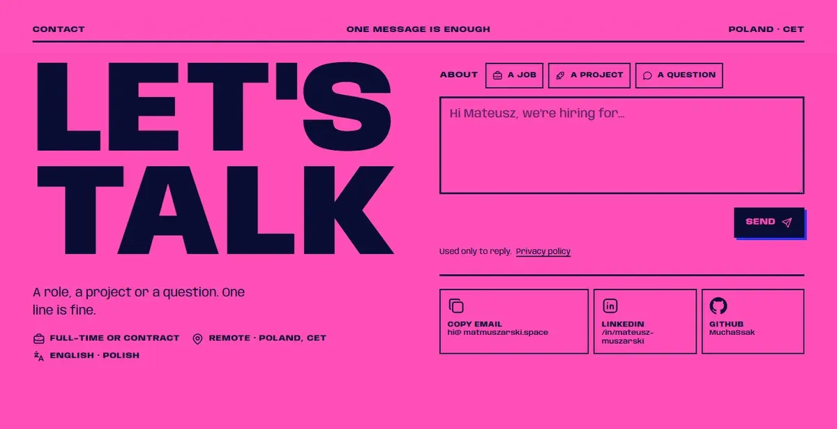
Paste an email, a phone number or a LinkedIn link and the reply field fills itself. It works without JavaScript too.
Round 2
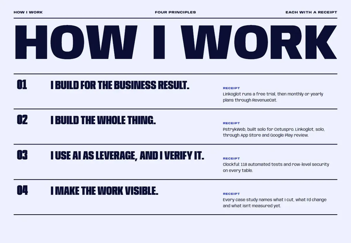
Four principles as numbered lines. Easy to write, easy to skip.
Now
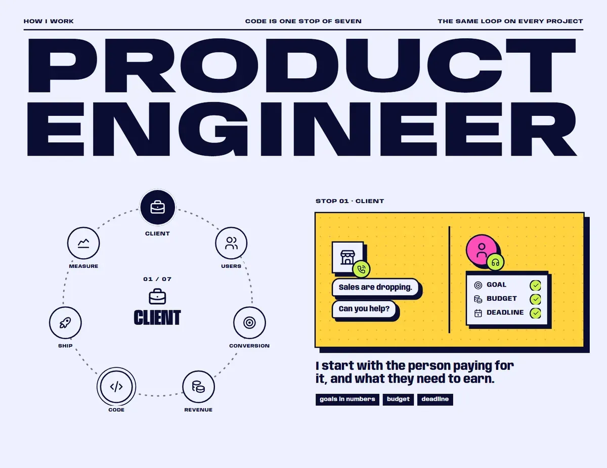
The decision Tell it as a story you can see.
A ring of seven stops, each with a drawn scene and a real example.
TV
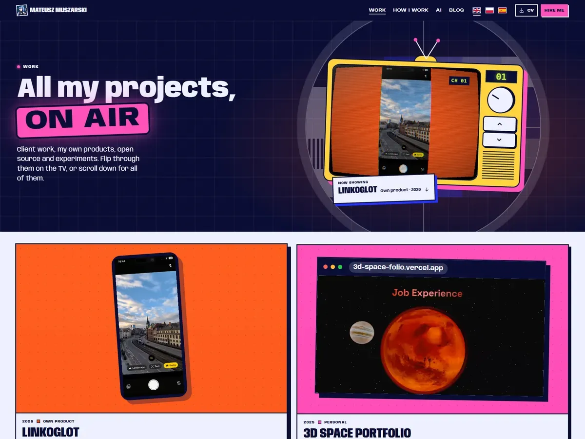
A retro TV flipping through the projects, and a drawn scene wherever there was nothing to film. Fun, but too much of it: it looked vibe coded.
Night
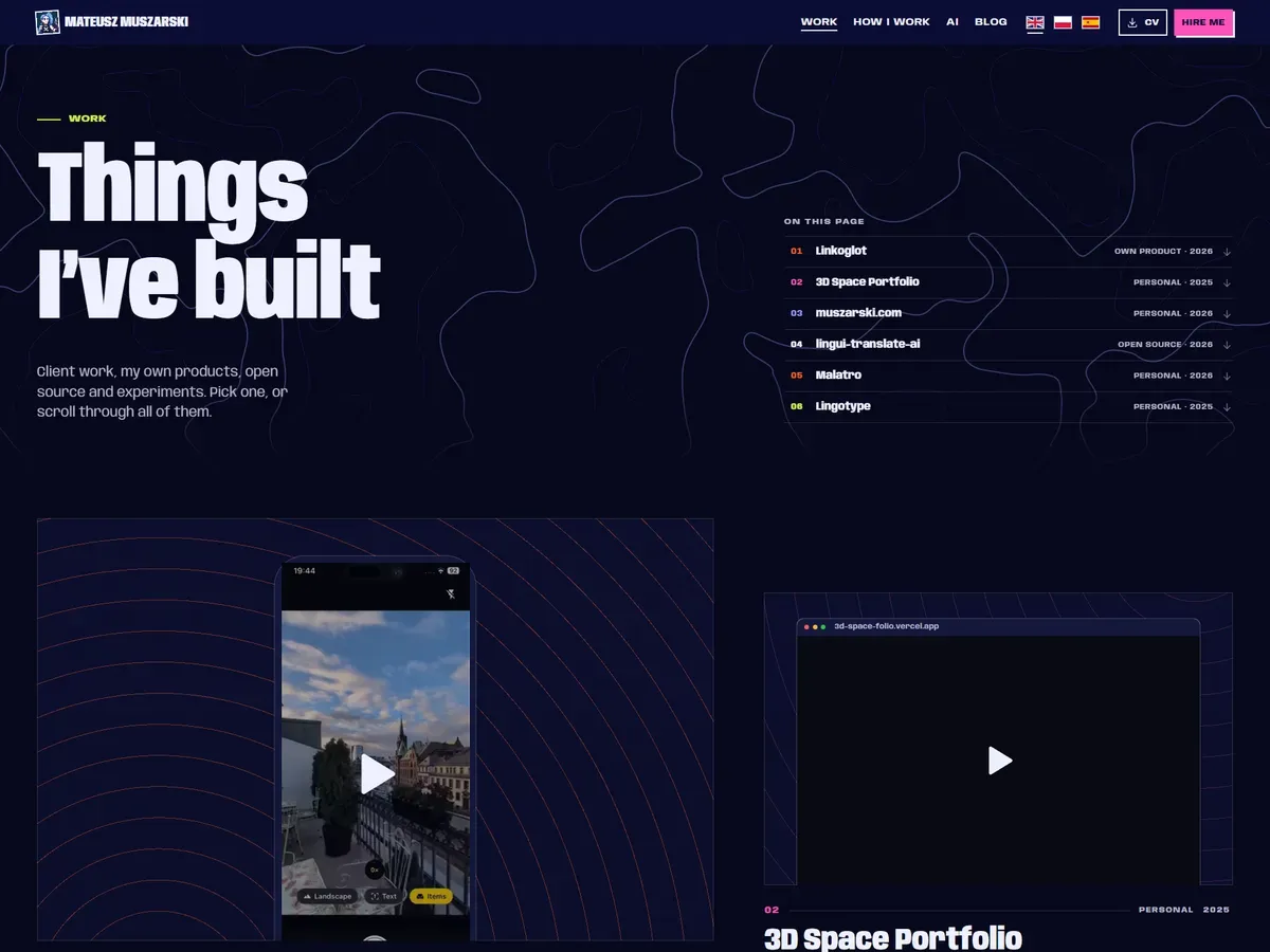
One dark field, a contour map under the title, plates staggered left and right and an X-ray lens over every capture. Calmer, and hard to read.
Now
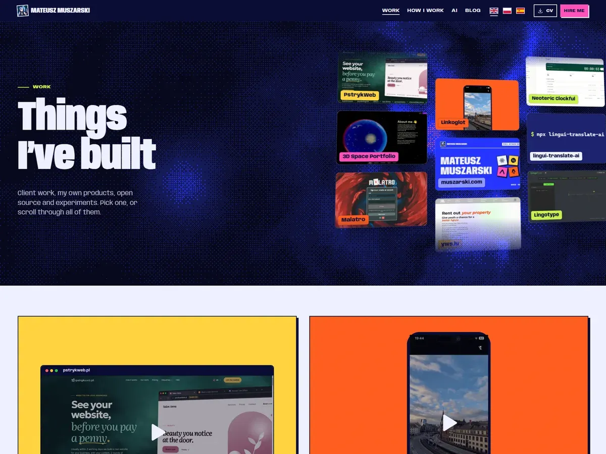
The decision Easy to scan first, then the show.
A wall of every project to jump from, then a plain grid of cards on a light field. The contour lines moved to the footer.
Before
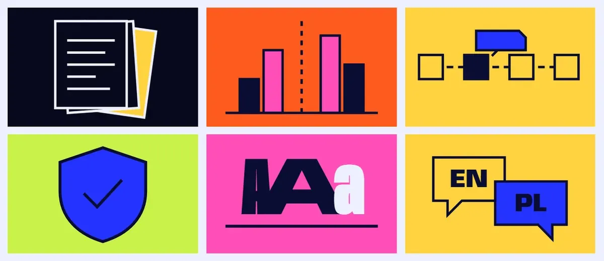
Colours came from the card's place in the list, so a post changed colour between pages.
After
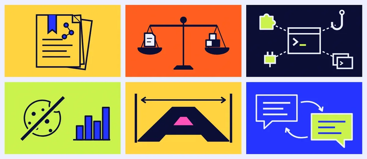
The decision One palette per cover, and the topic drawn literally.
A scale for a comparison, a crossed-out cookie for cookieless analytics. No words.
The rule behind all six: show the thing, cut the paragraph.
What do the other pages look like?
Every page gets the same care as the home page, on a laptop and on a phone.
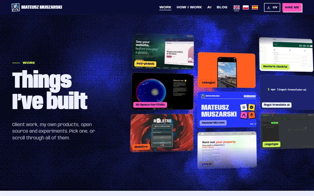 All projects
 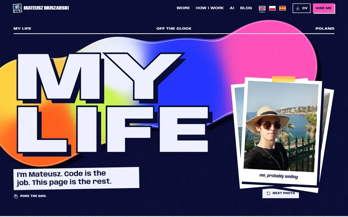 My life
 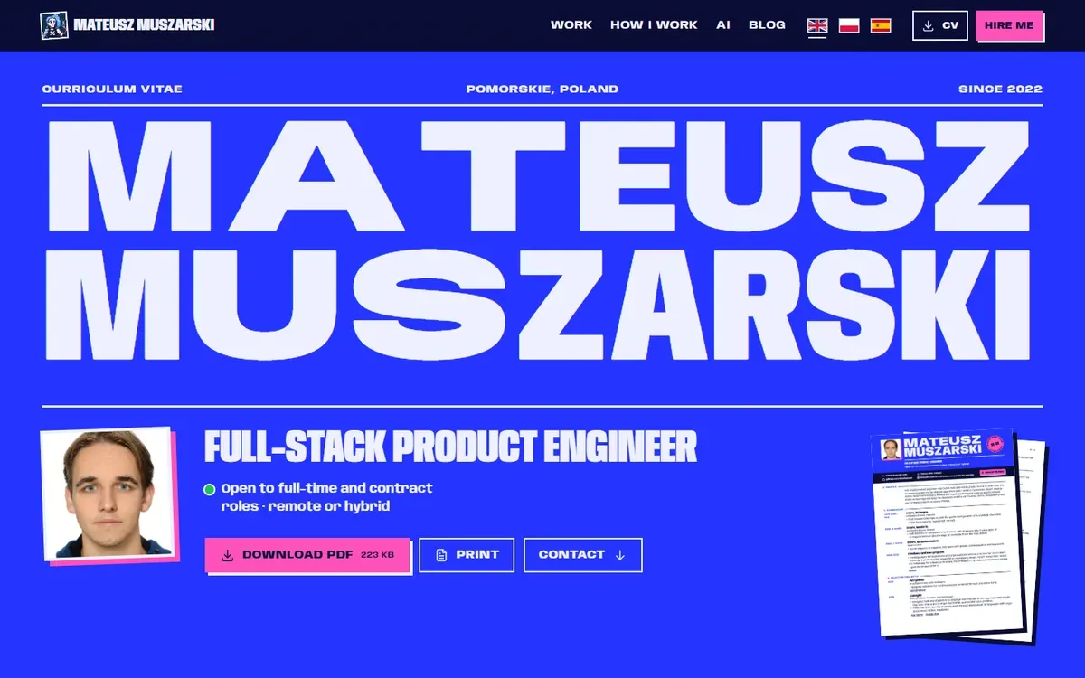 CV
CV 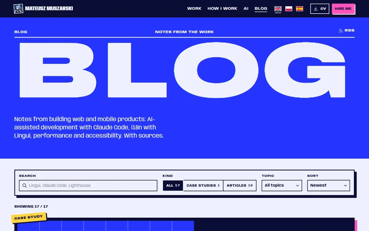 Blog
Blog 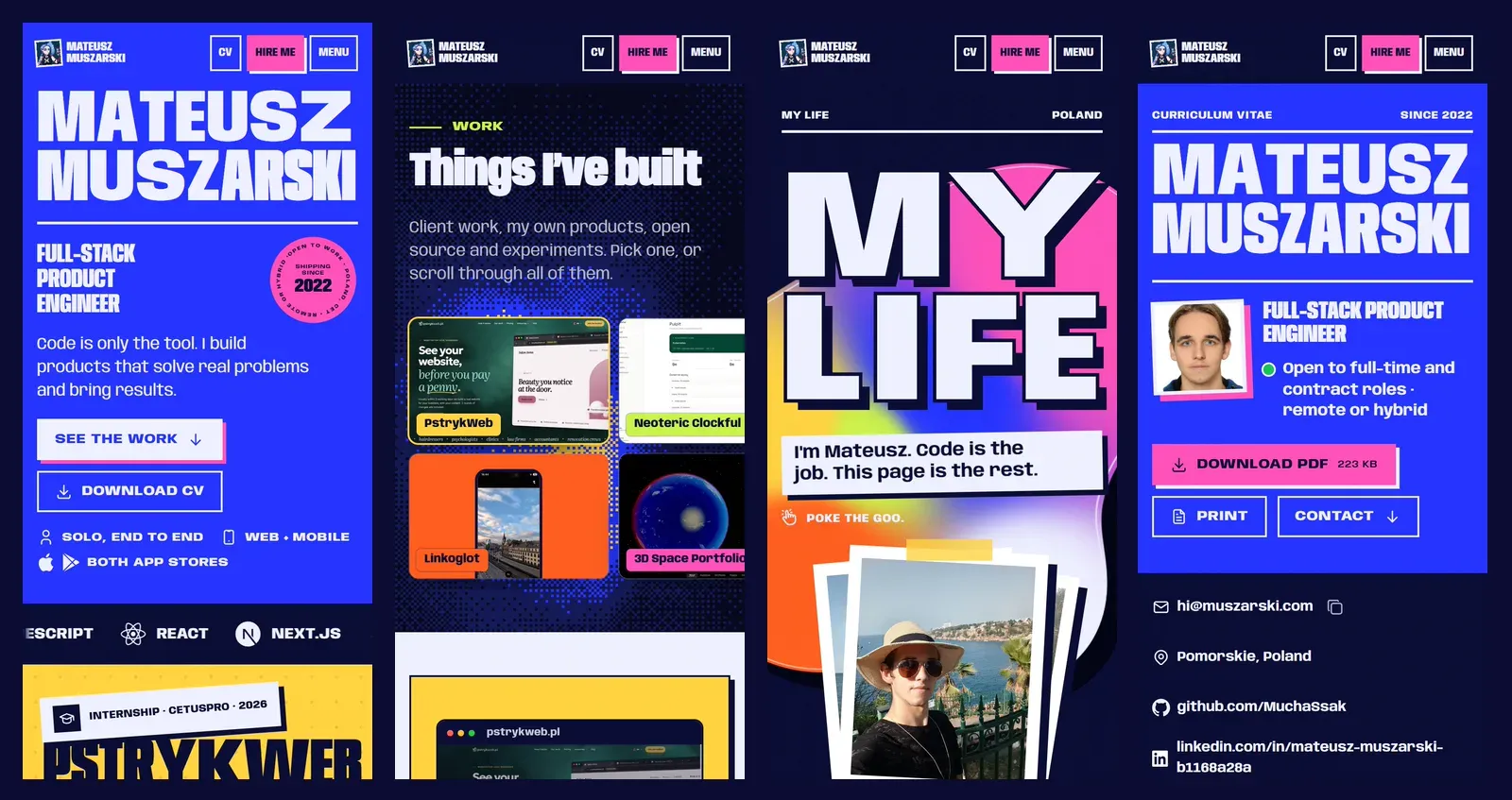
What are the small details?
The name fills the screen without JavaScript. At build time a script measures the font and works out the exact width for each line, so the name fits edge to edge before any script runs (how it works).
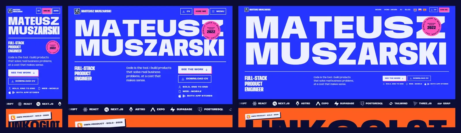
Phones get the same site. Every hover effect has a twin for touch (how), and the contact form has its own write-up, bug included (a contact form on a static site).
Who else is it built for?
Everyone, including people who use the web differently. A site that only works with a mouse and perfect eyesight shuts people out, and I'd rather it didn't. So:
- Motion you can stop. One “Pause motion” button stops everything, and with reduced motion turned on, everything shows its final state (how that works).
- A keyboard gets everywhere. A skip link jumps past the header, every hover has a focus twin, and focus never hides under the sticky header.
- Screen readers hear the full story. Hidden text adds what the eye gets from context, like “opens in a new tab”, and every button's name starts with the words you see on it.
- Contrast is tested, not eyeballed. A unit test checks every colour pair, and axe runs on every page.
How do search engines know who I am?
Sitemaps and meta tags are the floor. To find me by name, and one day show a knowledge panel, a search engine has to be sure who the site is about. So every page tells it the same story:
- One person, one id. The home page and the CV describe me as one
Personin structured data: my name, my role, my real portrait and my profiles. Every post and My life point back to it, and the links to my profiles carryrel="me". - Real photos with real facts. My life shows my own photos, each one marked up with where and when it was taken, and listed in the image sitemap.
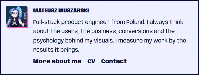
- A named author. Every post is a
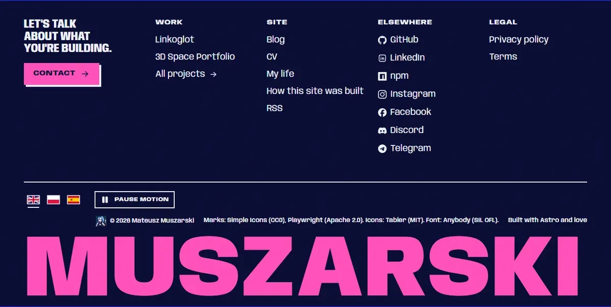
BlogPostingby that same person, with an author box under it, and every outside fact has a dated source. - A footer that does the work. Every page links to the projects, the CV, the blog, its RSS feed and my profiles.
- One address per page. One canonical URL, the language versions linked to each other, and a share card for every page in every language.
The build fails if a page loses its title, description or canonical, or if the structured data stops parsing.
 Author box
  Footer
 How is every change checked?
- 01 Static Types, lint and unit tests.
- 02 Browsers Playwright on every page, with axe for accessibility.
- 03 Eyes Screenshots at phone, tablet and desktop widths that I look at myself.
- 04 Speed Lighthouse on a slow phone.
Nothing is done until the checks pass and I've looked at the screenshots myself.
What is it built with?
| Part | Tool |
|---|---|
| Framework | Astro 7 (why not Next.js) |
| Language and styling | TypeScript, Tailwind CSS 4 |
| Translations | Lingui |
| Repo | Turborepo and bun |
| Font | Anybody, a variable font (OFL) |
| Icons | Tabler (MIT) and Simple Icons (CC0) |
| Hosting | Vercel |
| Contact form | EmailJS behind a Vercel function, Cloudflare Turnstile |
| Analytics | Umami Cloud, cookieless |
| Tests | Playwright, axe-core, Vitest, Lighthouse |
| AI | Claude Code |
Where did it end up?
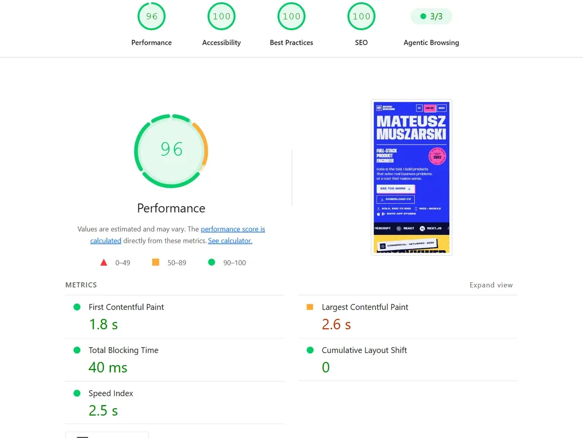
If you'd like to talk about building something like this, or about a role, my contact form is one message long.
Sources
- llm-wiki.md, Andrej Karpathy's idea file (GitHub Gist, 4 April 2026) (opens in a new tab) (accessed )
- Lighthouse performance scoring (Chrome for Developers) (opens in a new tab) (accessed )
- Understanding Success Criterion 2.2.2: Pause, Stop, Hide (W3C) (opens in a new tab) (accessed )
- Awwwards, Sites of the Day (opens in a new tab) (accessed )
- Mobbin, a library of real app and web screens (opens in a new tab) (accessed )
- Playwright (opens in a new tab) (accessed )
- axe-core, accessibility rules engine (Deque) (opens in a new tab) (accessed )
- Solar System Scope, planet textures (CC BY 4.0), used in the old space portfolio (opens in a new tab) (accessed )
- Anybody, a variable font (Google Fonts) (opens in a new tab) (accessed )