
Hover effects on phones: every hover gets a tap, focus or scroll twin
Phones have no cursor. How this site gates hover with (hover: hover) and (pointer: fine) and gives every hover a tap, focus or scroll twin.
Phones have no cursor, so a hover effect may never fire, flash for a moment, or stick after a tap. On this site, hover movement sits behind @media (hover: hover) and (pointer: fine). Every hover also has a twin for touch and keyboard: a press, a focus style, a tap that does the same job, or content that is simply visible.
TL;DR
- Gate hover movement with
(hover: hover) and (pointer: fine). Keep:activeand:focus-visibleoutside the query, so taps and keys get their own feedback.- A hover may decorate or preview. It is never the only way to read a label, open a panel or start a video.
- WCAG sets the edges: 1.4.13 for content shown on hover or focus, 2.5.3 for labels you can see and say, 2.5.8 for targets a thumb can hit.
Where did the rule come from?
From my own review of this site's design comps on 5 October: phones don't have cursors, so every hover effect needs a twin. It is now a line in the project's lessons file and in the design system's do and don't table. The rest of that review is in the case study of this site.
A twin gives the same information or feedback without a pointer over the element. This site uses four kinds: a press, a focus style, a tap that does the hover's job, and scrolling something into view.
What does a phone do with :hover?
MDN is direct: :hover "is problematic on touchscreens". Depending on the browser, it might never match, match only for a moment after a touch, or keep matching until you touch something else. The last one is the one you notice: a card stays lifted after you tap it and come back.
CSS can ask about the input instead of guessing from the screen width:
| Media feature | What it asks (MDN) | Example values |
|---|---|---|
hover |
Can the primary input conveniently hover? | none: many phones only emulate hover with a long tap |
pointer |
Is there a pointing device, and how accurate is the primary one? | fine: a mouse; coarse: a finger |
any-hover, any-pointer |
The same, for any available input | useful when a second input matters |
I use the primary-input features: for decoration, what matters is how the page is most likely being used right now.
How is a hover gated on this site?
The buttons show the whole pattern. A primary button rests on a 4 px hard shadow. Under a mouse it lifts and the shadow grows to 7 px. Press it, with a mouse or a finger, and it sinks into its shadow.
@media (hover: hover) and (pointer: fine) {
  .btn:hover {
    transform: translate(-3px, -3px);
  }
  .btn-acc:hover,
  .btn-inv:hover {
    box-shadow: 7px 7px 0 var(--btn-shadow);
  }
}
/* Outside the query: a tap gets this too. */
.btn:is(.btn-acc, .btn-inv):active {
  transform: translate(4px, 4px);
}
:focus-visible {
  outline: 3px solid currentColor;
  outline-offset: 3px;
}
Three states, three audiences: the lift for the mouse, the press for anyone, the ring for the keyboard. Under reduced motion all of them finish at once, as the post on motion and the pause button explains.
What counts as a twin?
The hover effects on the home page and what stands in for each:
| Hover effect | Where | The twin |
|---|---|---|
| A button lifts, its shadow grows | every button | the press on tap; the focus ring |
| A row opens its detail panel | Competences | a tap or focus opens it; an accordion on phones |
| A step of the story lights up | AI section | a tap plays that step; the focus ring |
| A stop on the ring grows | How I work | a tap shows that stop and holds it for 9 s |
| Note cards straighten and lift | Writing | the same lift when the card's link has keyboard focus |
| A flag tilts, its underline draws | language switch | the underline on focus and on the current language |
| The Copy email tile inverts | contact | a tap copies; a status message confirms it |
The Copy email tile shows the address at rest, and if the browser refuses the clipboard, the status message shows the address instead.
Two of the twins on a phone:
 Tap opens a row
 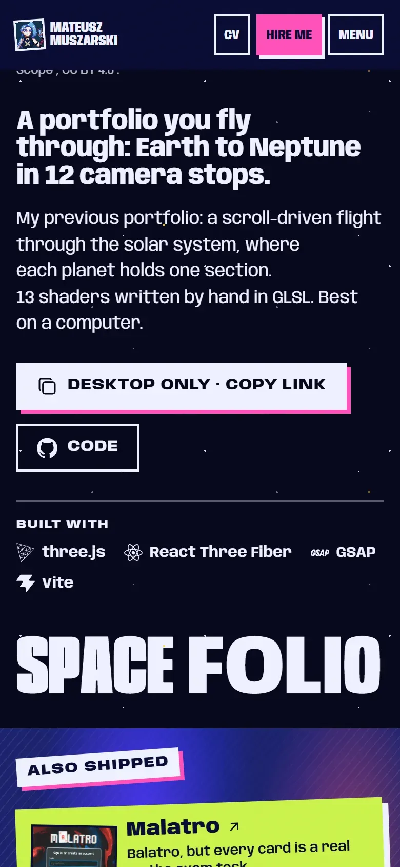 Touch gets copy link
 The second one isn't about styling. My old 3D portfolio has no touch navigation, so its chapter swaps the main button on (pointer: coarse). A mouse gets "Launch on desktop". A finger gets "Desktop only · copy link", which copies the address and suggests opening it on a computer. Same intent, honest about the device.
Scrolling is the fourth twin. Many portfolios play a project preview when the cursor rests on it. Here a project video plays while it is half visible (after your first interaction with the page), pauses offscreen, and a tap on the frame pauses it. You get the preview by scrolling, which you do on a phone anyway.
One hover has no twin on purpose. In the tool band, a tool's name turns pink under the mouse. The names are always visible and the band is not a control, so nothing is lost on a phone.
How does one row open on hover, focus and tap?
Competences is the busiest case. Above 900 px it is a list with the open row's details beside it, one row always open. Below that it becomes an accordion. Each row is a real <button> with aria-expanded, and without JavaScript every row is simply open.
The script, trimmed to the part that matters:
const wide = matchMedia("(min-width: 56.3125rem)");
const finePointer = matchMedia("(hover: hover) and (pointer: fine)");

for (const card of cards) {
  const button = card.querySelector<HTMLButtonElement>(".xc-btn")!;
  button.addEventListener("click", () => open(card, true));
  button.addEventListener("focus", () => wide.matches && open(card));
  card.addEventListener("pointerenter", () => wide.matches && finePointer.matches && open(card));
}
The click handler owns taps; it is the one path that works everywhere. Focus opens a row on wide screens, so tabbing through the list feels like hovering through it. The pointerenter guard matters: MDN notes that pointerenter also fires after a pointerdown from a device that can't hover. On a touchscreen that "hover" is the start of a tap.
Where does keyboard focus fit?
:focus-visible matches when the browser decides, by heuristics, that focus should show. MDN's example: a button clicked with a mouse usually shows no ring, while keyboard focus does.
For links I put hover and focus in one selector, so the two can't drift apart:
.sm-nav a:is(:hover, :focus-visible) {
  font-stretch: 110%;
  color: var(--accent);
}
The menu links widen on the font's width axis, the same axis behind the site's fitted headings.
Cards need one more step. A note card's title link stretches over the whole card, so focus lands on a small element inside a big one. :has() lets the card react to its own link:
.card.compact:has(.title a:focus-visible) {
  transform: translate(-3px, -3px);
  box-shadow: 11px 11px 0 var(--navy);
}
Which WCAG criteria apply?
1.4.13 Content on Hover or Focus (Level AA) covers extra content that appears on hover or focus. It must be dismissible, hoverable (the pointer can move onto it), and persistent until you move away or dismiss it. Here it applies to the Competences panel. The panel never closes when the pointer leaves and sits in its own column, so the list stays readable. Whether swapping panels counts as replacing content is a judgment call; I treat the rows like tabs.
The criterion exempts the tooltips a browser draws from title. That doesn't make them a good idea: MDN calls title "highly problematic" for touch-only, keyboard and screen reader users. The flags in the language switch have a title, but nothing depends on it. Each flag link carries its language name as screen reader text, and the menu shows the names next to the flags.
2.5.3 Label in Name (Level A) asks that a control's accessible name contains its visible text, ideally at the start. It exists for speech input: people say the label they see. A label that appears only on hover is one a phone user never sees, so every label here is visible at rest. The CV button reads "CV", then, for screen readers only, "(PDF, then the CV page)".
2.5.8 Target Size (Minimum) (Level AA) asks for 24 by 24 CSS pixels, or enough spacing. I aim higher: buttons are 46 px tall (40 px in the sticky header), and the flag links 44 px.
How do I check it?
Mostly by reading. I search the source for :hover and sort the hits. Lifts, shadows and anything that moves belong inside the media query. Plain link styles (an underline, a colour) may stay outside: a sticky one gives you a coloured link, not a jumped layout.
Sorting the hits on 6 October, while writing the first version of this post, turned up four small movements that weren't gated. They were the "Also shipped" tickets under the project chapters, the flag tilt and two pieces of the My life page. All had a focus style, but on a phone a ticket could stay lifted after a tap. The same day, each movement moved behind (hover: hover), with its focus style kept for everyone.
Limits
- No automated test covers hover. The end-to-end suite runs a desktop Chrome profile, so the twins are checked by reading the code and by hand.
- The phone pictures come from Chromium's touch emulation, and the press state hasn't been checked on a real iPhone (my WebKit runs are on Windows).
- The Competences panel against 1.4.13 is my reading of the criterion, not an audit.
If you are on a phone now, the Competences section on the home page is the quickest test: tap a row and it opens under your thumb, no cursor needed.
Sources
- :hover (MDN) (opens in a new tab) (accessed )
- hover media feature (MDN) (opens in a new tab) (accessed )
- pointer media feature (MDN) (opens in a new tab) (accessed )
- any-hover media feature (MDN) (opens in a new tab) (accessed )
- :focus-visible (MDN) (opens in a new tab) (accessed )
- :has() (MDN) (opens in a new tab) (accessed )
- Element: pointerenter event (MDN) (opens in a new tab) (accessed )
- title global attribute (MDN) (opens in a new tab) (accessed )
- Understanding SC 1.4.13: Content on Hover or Focus (W3C WAI, WCAG 2.2) (opens in a new tab) (accessed )
- Understanding SC 2.5.3: Label in Name (W3C WAI, WCAG 2.2) (opens in a new tab) (accessed )
- Understanding SC 2.5.8: Target Size (Minimum) (W3C WAI, WCAG 2.2) (opens in a new tab) (accessed )