
Psychology in UX and on the frontend: persuasion you can defend
Scarcity, social proof, anchors, defaults and progress bars, built honestly in code, and where EU and Polish law draws the line on dark patterns.
Every interface persuades: the order of the plans, the plan already selected, the number under the stars. Someone chose each of those, often the developer who wrote the component. Most of the psychology behind them can be used honestly, and the line is simple: real data, the whole price, and a "no" as easy as "yes". EU law draws the same line, and Poland's consumer watchdog fines shops that cross it.
TL;DR
- Eight effects do most of the work on screens: loss aversion, scarcity, social proof, anchoring, defaults, decoys, the goal gradient and reciprocity.
- The honest version reads real data: stock from the inventory, a countdown to the offer's real end, a crossed-out price that was the lowest of the last 30 days.
- The dark version invents it. EU guidance bans fake timers and made-up counts, and UOKiK fined a Polish shop for countdowns that kept starting over.
Not legal advice: I'm a developer who read the primary sources. If a pricing page matters to your business, ask a lawyer.
Why is this a frontend developer's problem?
Because the decisions land in code. Which radio button has checked, whether a box starts ticked, where the crossed-out price comes from: these are props, defaults and data bindings.
The European Commission's guidance on the Unfair Commercial Practices Directive (UCPD) is blunt: "The UCPD does not require intention for the deployment of the dark pattern". A dark pattern shipped by accident is still a dark pattern. For an ordinary shop, the UCPD is the rule that bites. The Digital Services Act also bans deceptive interfaces (art. 25), but only on online platforms that aren't micro or small, and not where the UCPD or GDPR already apply.
I came to this from two sides: two Udemy courses in 2025, on marketing psychology and UX writing (listed on my CV), and my own app, Linkoglot, whose free trial turns into a subscription. My test for any persuasive component: would I be comfortable if the user read the code?
Which effects show up most on screens?
| Effect | What the source says | Honest use | Dark use |
|---|---|---|---|
| Loss aversion | "Losses loom larger than gains" (Kahneman and Tversky, 1979) | Say plainly what someone keeps or loses | Guilt-tripping the "no" button |
| Scarcity | "People want more of those things they can have less of" (Cialdini) | A stock note from real inventory | A timer that resets on every visit |
| Social proof | People "reference the behavior of others to guide their own behavior" (NN/g) | Real review counts with the source | Invented "12 people are viewing this" |
| Anchoring | Relying on "a single piece of information" to decide (NN/g) | A struck price that was really charged | A "regular" price nobody ever paid |
| Defaults | "People tend to stick to the defaults" (NN/g) | A default that suits most people | A pre-ticked paid add-on |
| Decoy effect | A clearly worse option lifts the one that beats it (Huber, Payne and Puto, 1982) | Three real plans, compared fairly | A plan that exists only to be rejected |
| Goal gradient | People speed up as they near a reward (Kivetz, Urminsky and Zheng, 2006) | A progress bar counted from real steps | "90% done" when it isn't |
| Reciprocity | "People are obliged to give back" what they got first (Cialdini) | A trial that is actually useful | A "gift" that hides a subscription |
Where do they show up on this site?
This site sells one thing, a conversation about a job, and it follows the same rules:
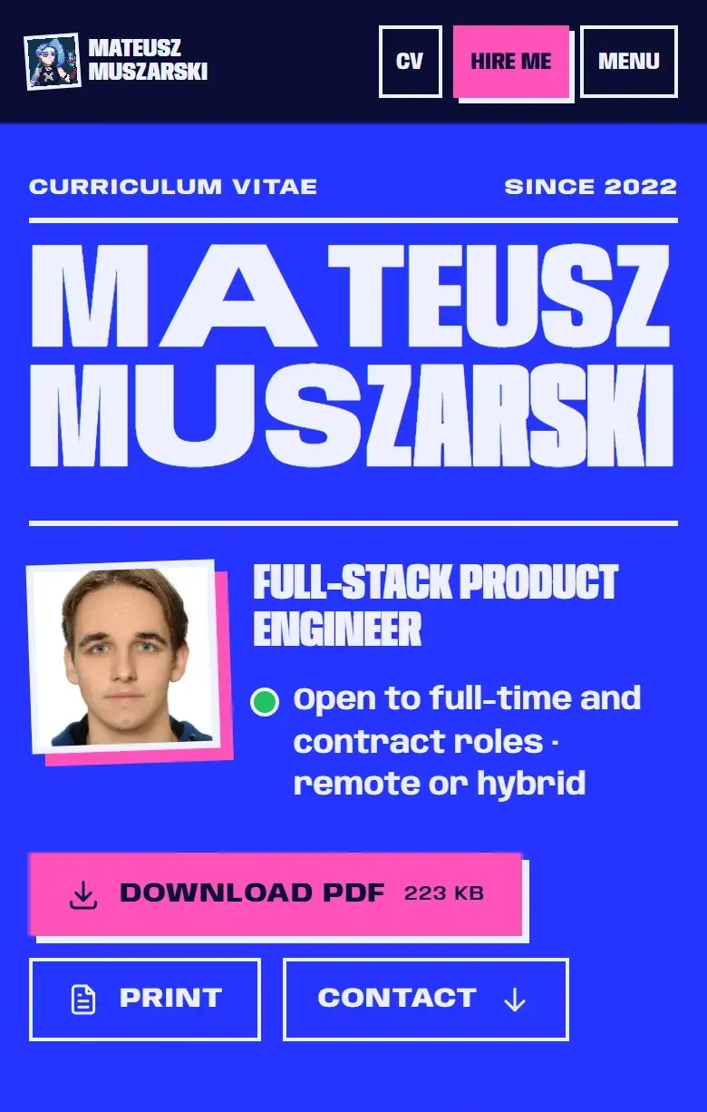 CV page
 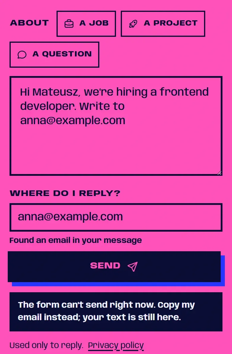 Contact form
 - No claim without the fact. The header says "Hire me" only while a setting says I'm looking for work. Switch it off and the same button reads "Contact".
- The whole cost up front. The PDF button on the CV page shows the file's size, read from the file itself at build time.
- No default picked for you. The topic chips above the contact form are optional, and none starts selected.
- Loss aversion, used to reassure. If a message fails to send, the text stays in the box and the error says so. Below the send button, one line says what your address is for.
How that form works, bug included: a contact form on a static site.
How do I show scarcity without lying?
Scarcity works only if it is true, so the component shouldn't render without the truth. This stock note takes the number from the inventory and shows nothing without one:
---
// StockNote.astro: the count comes from the inventory, or nothing renders.
interface Props {
  stock: number | null; // null = we don't know right now
  threshold?: number;
}
const { stock, threshold = 5 } = Astro.props;
const low = stock !== null && stock > 0 && stock <= threshold;
---

{low && <p class="stock-note">Only {stock} left in stock</p>}
On a static site, a number baked in at build time goes stale. Render on request, fetch the count and say when it was checked, or leave the note out.
Countdowns follow the same rule: the deadline comes from the checkout's own data. The dark version is one line, a fresh fifteen minutes on every page load:
const endsAt = new Date(Date.now() + 15 * 60_000); // a deadline that never comesThe UCPD guidance bans false "limited time" claims in all circumstances (Annex I, No 7), and "this includes fake timers and limited stock claims on websites". In May 2025 UOKiK fined Azagroup, which runs the born2be.pl and renee.pl shops, nearly PLN 15 million. Its products were on promotion all the time, and its countdown timers were reset. The decision was not final.
How do I use social proof honestly?
Show counts from your own database and say where they come from: "4.6 from 312 reviews of verified orders" (made-up numbers), with a link to how reviews are checked.
Since the Omnibus Directive, that link is required: a trader who shows reviews must say whether and how it checks they come from real customers (UCPD art. 7(6)). Fake reviews, and claiming reviews are genuine without checking, are banned outright (Annex I, No 23b and 23c).
NN/g names the honest risk: social proof can backfire when it shows that "too few people approve". Wait until the number is worth showing; don't round it up. And a "12 people are viewing this" badge made up in the browser is "inaccurate information on market conditions", banned under Annex I, No 18.
How should a pricing table use anchors and decoys?
An anchor is the first number someone sees, and it shapes how the next one feels, like an original price next to a discounted one. EU law says which original price counts. Article 6a of the Price Indication Directive defines it as "the lowest price applied by the trader during a period of time not shorter than 30 days prior to the application of the price reduction". The Omnibus Directive added it; in Poland it is art. 4 of the act on informing about prices, for goods and services alike.
So the crossed-out number comes from the price history:
---
interface Props {
  price: number;
  lowest30: number; // the lowest price in the 30 days before the reduction
  locale: string; // "en-GB", "pl-PL"...
  currency: string; // "EUR", "PLN"...
}
const { price, lowest30, locale, currency } = Astro.props;
const money = new Intl.NumberFormat(locale, { style: "currency", currency });
const off = Math.floor((1 - price / lowest30) * 100);
---

<p class="price">
  <strong>{money.format(price)}</strong>
  <del><span class="sr-only">Lowest price in the previous 30 days: </span>{money.format(lowest30)}</del>
  <span>-{off}%</span>
</p>
Intl.NumberFormat gives a Polish page its decimal comma for free. Math.floor rounds the discount down, so the label never promises more than the maths. And since most screen readers don't announce <del> (MDN), the hidden text says which price is the old one.
In January 2026 UOKiK fined Zalando nearly PLN 31 million and Whaleco (Temu) nearly PLN 6 million over this rule. Zalando measured discounts from "regular" prices instead of the 30-day lowest, and Temu's lowest price was sometimes missing or wrong. Neither decision was final.
On a monthly or yearly toggle, the honest anchor is the monthly price you really charge, times twelve, and the yearly card states the full amount charged once a year. The guidance wants one-off and recurring amounts "clearly provided to the consumer".
Decoys are subtler. Huber, Payne and Puto showed in 1982 that adding an option clearly worse than one plan (but not the other) pushes choices toward the plan that beats it. My test: if someone buys the middle plan, am I happy to deliver it? If it exists only to be rejected, I cut it.
Are defaults and pre-ticked boxes allowed?
Defaults work because "people tend to stick to the defaults", as Jakob Nielsen wrote in 2005. He was fine with pre-selecting the one-year option in a subscription, within a limit: "if you consistently pick the most expensive option as the default, you'll lose credibility."
Where money is involved, the law is stricter: the UCPD guidance notes that pre-ticked boxes charging for extra services are banned by Article 22 of the Consumer Rights Directive. I apply the same rule to newsletter boxes: a box someone has to untick isn't a choice they made.
<label>
  <input type="checkbox" name="newsletter" />
  Send me the monthly newsletter (you can unsubscribe in one click)
</label>
No checked, and the label says how to undo it.
How do progress bars use the goal gradient?
People work harder as a goal gets closer. In Kivetz, Urminsky and Zheng's study, café customers whose 12-stamp card came with 2 stamps already filled in finished their 10 purchases faster than those with a plain 10-stamp card. Same work, but it felt further along. On a long form, the honest version counts real steps:
const required = [...form.querySelectorAll<HTMLInputElement>("input[required]")];
const bar = form.querySelector<HTMLProgressElement>("progress")!;

const update = () => {
  bar.max = required.length;
  bar.value = required.filter((input) => input.value.trim() !== "").length;
};
form.addEventListener("input", update);
update();
A native <progress> with a <label> is accessible out of the box (MDN). A head start is fine when it's real, like fields filled in at sign-up. A bar that jumps to 80% on the first screen borrows the effect without paying for it.
Where does loss aversion become confirmshaming?
Losses weigh more than equal gains, so "You'll lose your saved lists" lands harder than "Keep your saved lists". Saying what someone loses is information. Writing the "no" to make them feel bad is not. The guidance says that "('confirmshaming' the consumer into feeling guilty) could amount to an aggressive practice under Article 8 UCPD".
A decline button reads "No, thanks", never "No, I don't want to learn faster". Cancelling works like this:
- 01 Cancel subscription The button says what it does and is as easy to find as the one that keeps it.
- 02 One honest screen What changes and when. No loop, no guilt.
- 03 Done No more steps than signing up took.
The guidance puts the last step as a principle: "unsubscribing from a service should be as easy as subscribing to the service". It also lists "one button very visible, another hidden" as manipulative.
What about reciprocity and free trials?
Give something useful first, like a trial that shows the product working, and people are more willing to give back. It becomes a trap when the gift hides a contract: the guidance covers "misleading free trials and subscription traps". I hold a screen like Linkoglot's to four things:
- The first screen of the offer says when the trial ends and the paid subscription starts.
- The price shown is the price charged, per period, in the local format.
- The order button says it starts a paid subscription.
- How to cancel is written next to the offer, not only in the terms.
Limits
- I read the regulations, the Commission guidance and UOKiK's own pages, not court rulings. The UOKiK decisions I cite were not final when announced.
- The studies are specific experiments, such as a café reward card. They show that the effects exist, not how big they will be on your page.
- The examples from this site are four details, not an audit of every screen.
If you build screens that have to convince someone, write to me about where you draw these lines. More on the subscription app in how I shipped Linkoglot alone, and another EU rule read from the source in cookieless analytics and Poland's art. 399.
Sources
- Kahneman, D. & Tversky, A. (1979). Prospect Theory: An Analysis of Decision under Risk. Econometrica 47(2), 263-291 (opens in a new tab) (accessed )
- Prospect Theory and Loss Aversion: How Users Make Decisions (Nielsen Norman Group) (opens in a new tab) (accessed )
- Dr. Robert Cialdini's Seven Principles of Persuasion (Influence at Work) (opens in a new tab) (accessed )
- Social Proof in the User Experience (Nielsen Norman Group) (opens in a new tab) (accessed )
- The Anchoring Principle (Nielsen Norman Group) (opens in a new tab) (accessed )
- The Power of Defaults (Nielsen Norman Group) (opens in a new tab) (accessed )
- Huber, J., Payne, J. W. & Puto, C. (1982). Adding Asymmetrically Dominated Alternatives. Journal of Consumer Research 9(1), 90-98 (opens in a new tab) (accessed )
- Kivetz, R., Urminsky, O. & Zheng, Y. (2006). The Goal-Gradient Hypothesis Resurrected. Journal of Marketing Research 43(1), 39-58 (opens in a new tab) (accessed )
- Commission Notice 2021/C 526/01: Guidance on the Unfair Commercial Practices Directive (EUR-Lex) (opens in a new tab) (accessed )
- Regulation (EU) 2022/2065 (Digital Services Act), EUR-Lex (opens in a new tab) (accessed )
- Directive (EU) 2019/2161 (the Omnibus Directive), EUR-Lex (opens in a new tab) (accessed )
- UOKiK: Informacje o obniżkach cen (consumer rights portal) (opens in a new tab) (accessed )
- UOKiK: Endless "promotions", decision by the President of UOKiK (27 May 2025) (opens in a new tab) (accessed )
- UOKiK decision RKR-1/2025 (Azagroup), 21 May 2025 (opens in a new tab) (accessed )
- UOKiK: Lowest price in the 30 days before the discount, penalties for Zalando and Temu (14 January 2026) (opens in a new tab) (accessed )
- <del>: The Deleted Text element (MDN) (opens in a new tab) (accessed )
- <progress>: The Progress Indicator element (MDN) (opens in a new tab) (accessed )